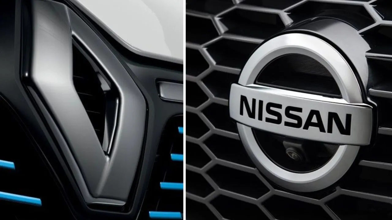
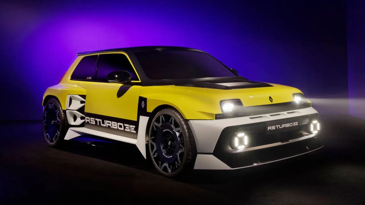
This is the all-new Renault logo
First showcased on the new Renault 5 Prototype at the company's 'Renaulution' event earlier this year, the French marque's new corporate identity has now been formally announced. Compared to the brand's current logo, the new logo follows a flat design, with two interlaced diamonds.

Set to make its production debut in 2022, the new logo will be Renault's ninth identity refresh.
First showcased on the new Renault 5 Prototype at the company's 'Renaulution' event earlier this year, the French marque's new corporate identity has now been formally announced. Apparently, Renault had kept mum about the new logo during the Renaulution event, and it was only after receiving praise for both the model (Renault 5) and the badge that Renault decided to officially launch the new logo.
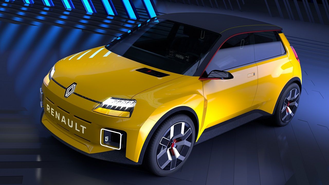
As the marque explains, the logo has been 'redesigned as Renault moves into a new era to meet the challenges of a modern international brand, with a significant focus on the digital world.' In the words of Gilles Vidal, Renault Design Director, the new logo, 'is a balance between recognition of the brand's heritage and entering a new era, a symbol of the future. The restyled diamond perfectly embodies the "New Wave" era that Renault has entered.'
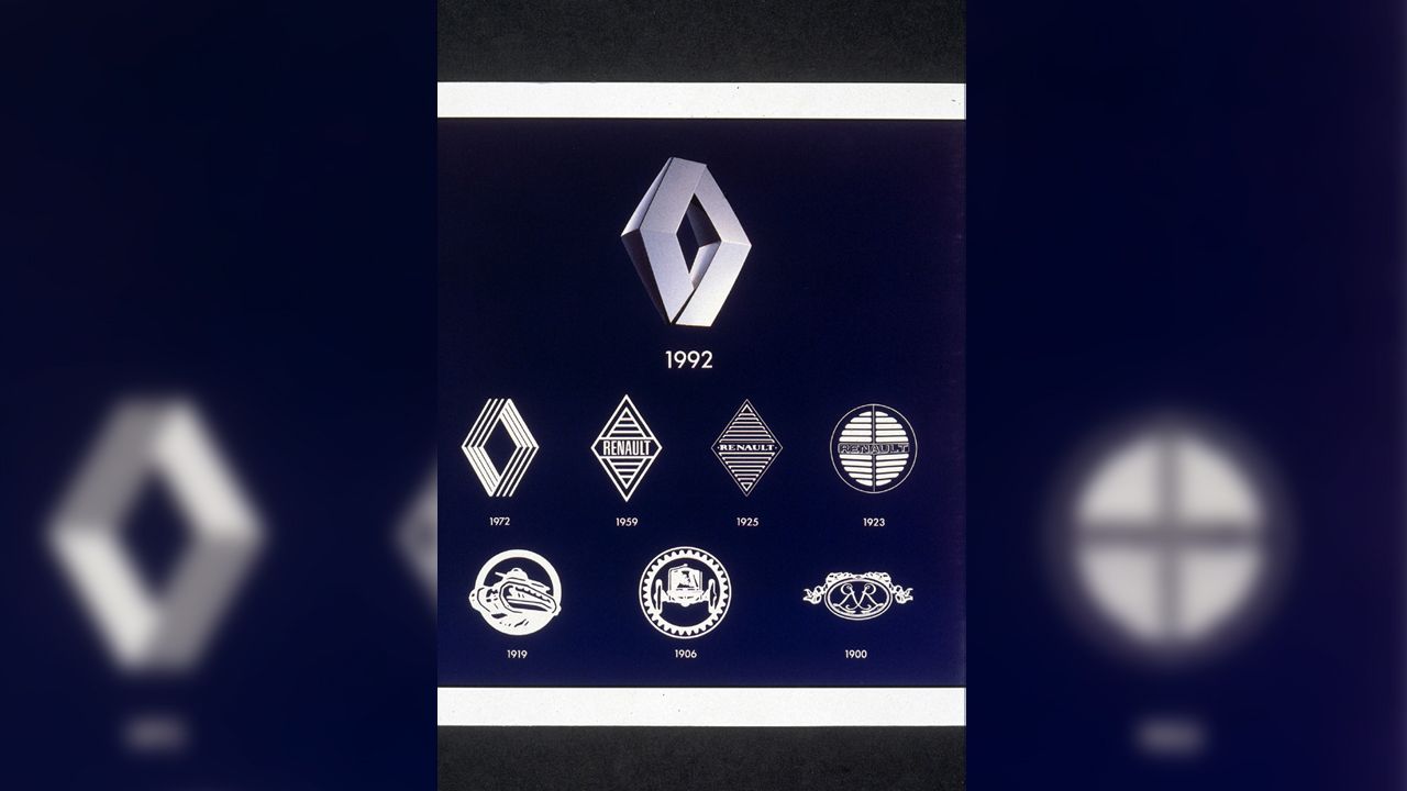
Compared to the brand's current logo, a 3D diamond (the current logo has been in use since 1992, with a slight design tweak in 2015), the new logo follows a flat design, with two interlaced diamonds. In fact, the design of the ninth emblem looks like it's been inspired by the brand's 1972 logo. The new logo has been described as 'uncluttered, with no signature or typography' that has been designed 'to deliver movement.' As for the flat treatment, it 'enables its animation, for example on video or digital media, but also on vehicles, for their welcome sequence.'

The new logo is expected to debut on a production model sometime in 2022, although it is yet to be confirmed on which one. By 2024, the entire Renault model range will carry the redesigned emblem.
Renault isn't the only brand that's undergone an identity refresh recently. Of late, a lot of brands ranging from Peugeot, Kia, GM to Maserati, Nissan, Opel, and Volkswagen have either refreshed or completely redesigned their brand identities.


.webp)
