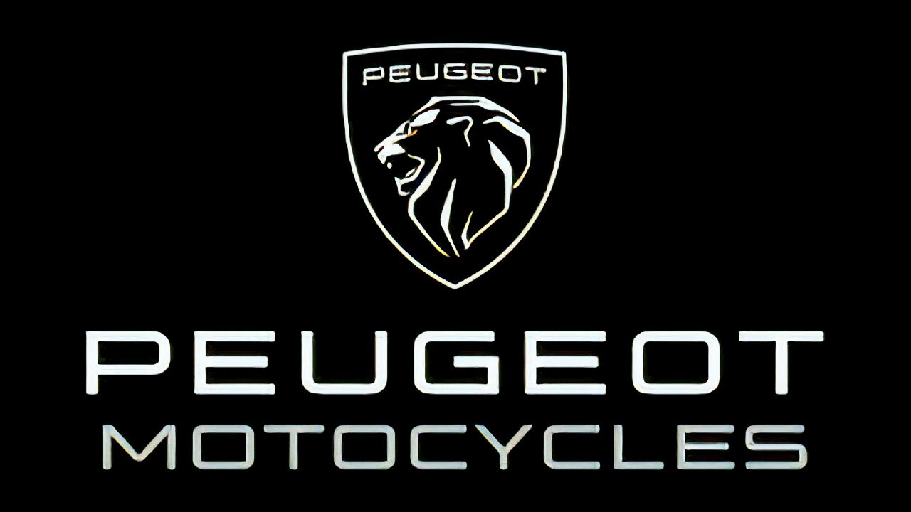
The French manufacturer has revealed a new logo for Peugeot Motocycles. The new design is a part of the company's 210th-anniversary celebrations and draws inspiration from previous logo designs.
Peugeot might not be one of the most popular two-wheeler manufacturers, but it's certainly one of the oldest. The company itself has been around since 1810. However, earlier it was in the business of metallurgy. It wasn't until 1898 that its engineers added a motor to a bicycle frame and it entered into the motorcycle business.
To celebrate its 210th anniversary, Peugeot Motocycles (without an 'r') had launched a special limited edition scooter in October 2020. Now, at the start of 2021, it has decided to change its logo as well. For as long as we can remember, the Peugeot crest was always a prancing lion. In fact, the lion logo first started to appear on Peugeot vehicles in 1948. Peugeot has stated in the past that the lion represented strength and sharpness of the company's products, which include two, three, and four-wheel vehicles. In 1998, the logo was redesigned and included the lion's paws as well, which represented the power and corporate balance of the company, according to Peugeot.
In 2021, Peugeot has redesigned its logo to be sleeker and more modern. The entire body of the lion has now been removed. The logo now only features the lion's head in profile. The new logo was designed to link the company's 210-year history. Interestingly, Italian bike manufacturer Aprilia's logo also featured a similar side profile of a lion.
Peugeot Motocycles has been selling its products mostly in the European markets over the years. However, the French company was bought over by Indian manufacturer Mahindra in 2019. This might mean that we may just see Peugeot Motocycles make an entry into the Indian market soon. However, as of now, there have been no confirmations.
ALSO READ:
Bajaj Platina 110 ABS launched in India
TVS Apache RTR 200 4V single-channel ABS updated with riding modes


Write your Comment