MotoGP Unveils New Logo Design at Barcelona Season Finale
MotoGP has revealed a minimalist new logo, replacing the iconic chequered flag design from 2002, as part of its 2025 brand refresh by promoter Dorna.
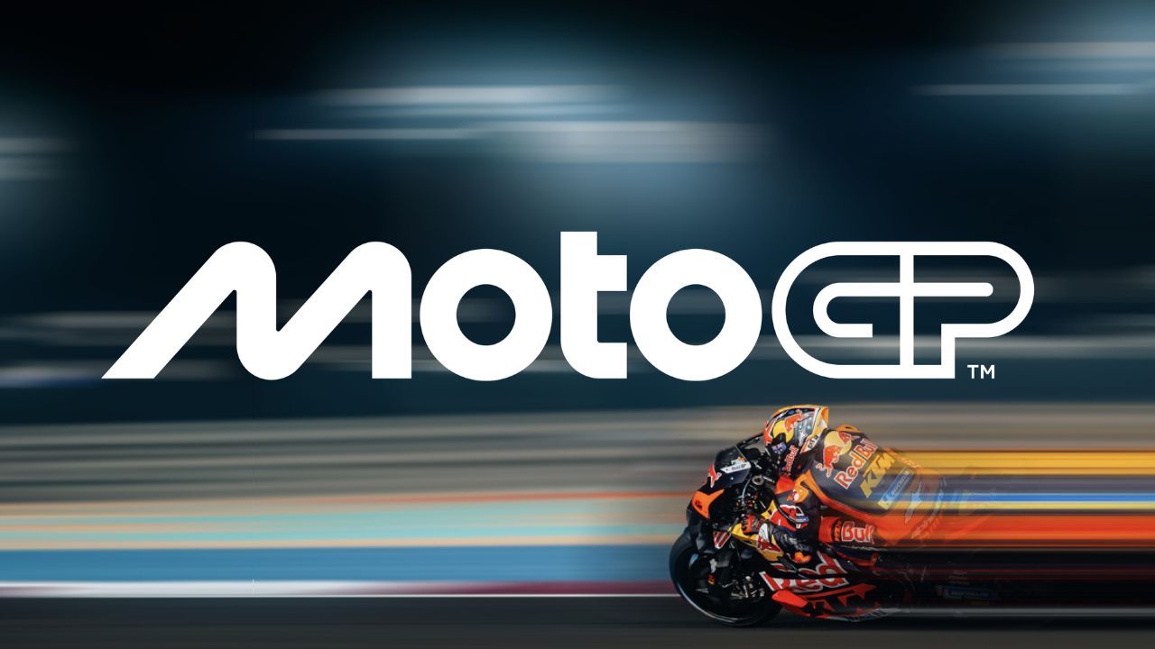
MotoGP has unveiled a bold new logo, signifying a significant rebranding effort. The fresh design, crafted by renowned design firm Pentagram, marks the sport's most substantial visual overhaul since 2002. The new logo was officially unveiled at the post-season gala held at the prestigious National Art Museum of Catalonia. To accompany the reveal, a captivating video narrated by Game of Thrones star Emilia Clarke was presented. This marks MotoGP's first logo update since 2007. While a black-and-white version of the logo leaked online ahead of the season finale due to EU trademark policies, the official unveiling occurred post-race. The new logo represents a significant departure from its predecessor, featuring a more modern and dynamic design that reflects the excitement and energy of MotoGP. It is also more versatile, adapting seamlessly to various applications across digital and physical platforms.
Carmelo Ezpeleta, CEO of Dorna Sports: “We’re very excited to reveal our new identity and invite fans around the world to meet the new MotoGP. Working with Pentagram has been an incredible adventure leading to what we hope our fans will agree is an incredible result. A brand is more than a logo, and MotoGP is more than a sport. The process has taught us a lot about both and we’re very proud to show the world the results. The key question throughout has been, ‘What is MotoGP?’, both now and looking forward to who we want to be, and we hope this new identity communicates every aspect of that, from the speed to the passion and everything in between. This is MotoGP."
MotoGP: The New Logo
The new design of the MotoGP logo emphasises the nature of motorcycle racing. According to MotoGP, the central "M" of the logo symbolises two motorcycles leaning into a corner. The "O"s represent the geometry of a motorcycle wheel, while the "t" signifies the rider, highlighting the harmonious interplay between human and machine. The final "GP" evokes a racetrack, reinforcing the logo's sporty and dynamic aesthetic.
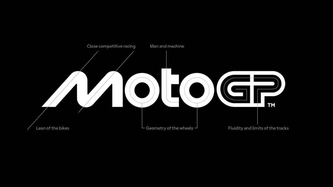
One of the most notable changes is the removal of the chequered flag, a long-standing symbol of motorsports. The typography has also been modernised, aligning with the design language of the recently launched Women's Motorcycling World Championship.
Also Read: MotoGP: Dani Pedrosa Extends Contract with KTM as Official Test Rider
To ensure a cohesive brand identity across all Grand Prix racing classes, the logos for Moto2, Moto3, and MotoE have also been refreshed, reflecting the same design language as the new MotoGP logo. As MotoGP gears up for its 2025 overhaul, this unified visual identity signifies a new era for the sport.

.webp)
.webp)

Write your Comment on